Why Good Ideas Get Ignored in Bad Designs
All of us have read annual reports or gone through pitch decks that are jam-packed with material, where the main point is obscured by blocks of technical terms. Content isn’t always the issue. It is the blurriness of the image.
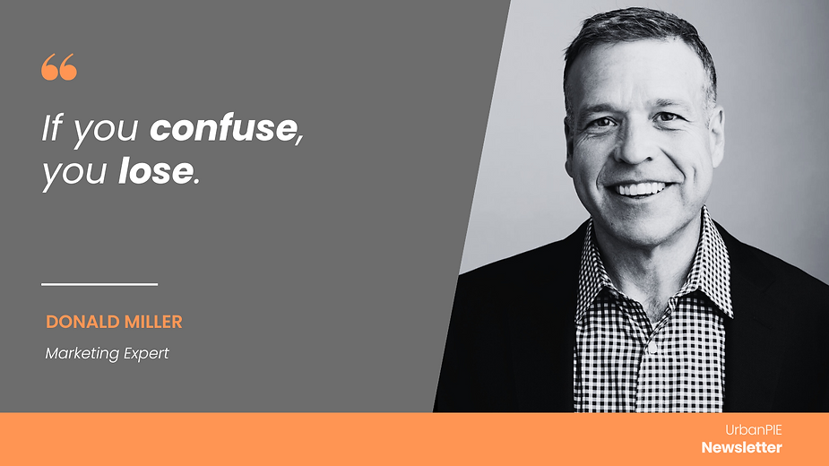
As marketing expert Donald Miller puts it, “If you confuse, you lose.” This holds especially true in the world of visual communication. Whether it’s a pitch deck, an annual report, or a social impact dashboard — every visual element should clarify, not complicate. Stakeholders today have limited attention spans and even less tolerance for design that demands effort to understand. Complex charts, excessive jargon, and cluttered layouts dilute the message. Clarity, hierarchy, and purpose-driven design ensure your visuals inform, persuade, and resonate with the people who matter.
Every Visual Is a Strategic Message, Not a Decorative Element
Every visual touchpoint must have a purpose, whether you’re using a pitch deck to attract investors or an annual report to document impact. Design is now about being understood, not just about looking good. In a time when attention is scarce, your actions are just as important as your words. Purpose-driven visual communication becomes crucial at this point.
Clarity Wins in Bandwidth-Constrained Environments
The majority of customers, donors, and clients are under time constraint. Their attention is wasted by a report that fails to provide the main takeaway or by a deck that obscures the USP with numerous layers of graphics. Visuals ought to serve as aids for navigation. They ought to indicate the next crucial item, just like airport signage. Conversely, misused design results in apathy, drop-off, and frequently lost chances.
Design Is Not an Accessory. It’s the Architecture of Engagement
The way information flows is determined by design. Every design choice affects perception, from font size to data arrangement, from colour selection to slide order. Bad design can lessen influence in industries that rely heavily on trust and clarity to establish credibility. At Urban Innovation Lab (UIL), we believe in designing with purpose. Every element—icon, illustration, layout—should communicate a strategic intent. Whether you’re introducing your company or showing results, your audience should be able to grasp your message at a glance.
The Problem: Form Without Function
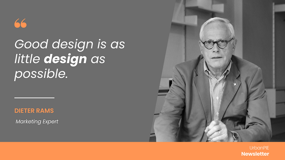
Aesthetic overkill is a prevalent problem in many studies and presentations. Although they appear slick, decks confound the audience. Colour is used in reports, but not always. The medium obscures the message. Good design isn’t about embellishment—it’s about function. As Dieter Rams famously said, “Good design is as little design as possible.” At its core, effective visual communication is about stripping away the unnecessary to let the core message stand out. Design is not decoration — it is strategy made visible. When visuals are disconnected from the larger narrative or overloaded with visual clutter, they create noise instead of clarity. Whether you’re presenting key metrics or showcasing impact, every design choice must serve the purpose — to guide, inform, and reinforce the story you’re telling.
Begin With a Purpose and Work Backwards is the solution
At UIL, our approach is grounded in intent. Whether it’s a 12-slide pitch or a 60-page report, we begin with the question: What do you want the reader to take away? From this, we build backward. We map the narrative first, identify key milestones or value propositions, and then visualise them in a way that reinforces—not distracts from—the message.
Our design process follows a deliberate path:
- Understand the strategic goals.
- Identify audience expectations.
- Organise content into logical flows.
- Use design to highlight, not decorate.
Case Study: Designing an Annual Report for Recall, Not Just Review
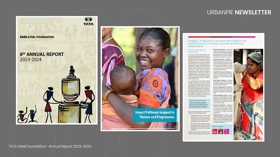
When redesigning the annual report for a leading CSR foundation, UIL began with one critical step: identifying the three core messages stakeholders needed to remember. The original 70-page draft was restructured into a concise, 36-page document. Each section was supported by a visual summary, and a clear colour-coded system improved readability across formats. The result? A report that didn’t just look good — it worked. One reader summed it up best: “Easy to navigate, even on a phone.” That’s the impact of purposeful design.
Headlines and visuals should have a similar function
The role of a visual is the same as a good headline—to summarise and compel. Each visual should help the reader or viewer absorb information faster and better. That’s why we use:
- Bold section openers
- Icons with consistent meaning
- Pull quotes that anchor attention
- Infographics that tell a story
- Colour palettes aligned to brand tone
Design that caters to people, not just pages
It’s easy to forget that behind every pitch deck or report is a human being trying to make a decision. If your design doesn’t support that journey, you’re making it harder for them to trust, buy in, or act. As Edward Tufte puts it, “Good design is clear thinking made visible.” Every visual you present should be in service of the person on the other side of the screen or page.
UIL’s edge is the combination of communication strategy and design precision
Our editorial approach and meticulous design are what set UIL apart. Visuals are not considered decoration by us. We use them as instruments for comprehension, memory, and influence. Whether it’s a fundraising deck, an internal review report, or a public impact brochure, we approach every project with the straightforward tenet that if it doesn’t aid in communication, it doesn’t belong.
UIL is here to help you design with a purposeful approach
From pitch decks to annual reports, UIL specialises in making your communication purposeful, strategic, and accessible.
We offer:
- Design consulting for pitch decks
- Report planning and structuring
- Visual identity for strategic communication
- End-to-end layout and delivery
From your first investor slide to your tenth-year report, every visual in your communication toolbox offers an opportunity to be recognised and retained. Make it matter. You can design to express as well as to impress with the aid of Urban Innovation Lab. Let’s make your vision more clear.
FAQs
1. Is visual design really that important in reports or pitch decks?
Yes. Poor design leads to disengagement. Good design helps deliver your message faster and more memorably.
2. What kind of projects can UIL help with?
Pitch decks, strategy presentations, annual reports, investor documents, case studies, and visual storytelling assets.
3. We already have branding in place. Can you align with it?
Absolutely. We work within your visual identity guidelines while applying strategic clarity and improved layout.
4. What’s the typical timeline for a pitch deck or report project?
Pitch decks take 2–3 weeks; annual reports may take 5–8 weeks depending on content volume and inputs.
Closing note
Whether it’s a 5-slide pitch or a 50-page report, design is never just aesthetic — it’s strategy. At UIL, we believe every visual should do more than just look good — it should work hard. Want your next communication piece to reflect clarity, intent, and impact?
Let’s design it with purpose.
📩 Reach out to explore how we can transform your content into compelling, visual narratives.
Add a Comment